
Saturday, December 10, 2011
Still Alive
Just a heads up, I am still trying to keep this blog going. A combination of lack of time and account issues have lead to very few posts over the last few months. But I do have some concepts to post! Stick around...
Tuesday, October 25, 2011
Harvesting Gold
Sam sent in a concept a while back, I am finally getting around to posting it. Sam pointed out most concepts eliminate harvest gold (usually highlighting wheat instead), so he put together a home/road set that uses it. He also adds an alternate jersey that is completely devoid of harvest gold.


Monday, October 10, 2011
2011-2012 3rd Jersey Schedule Posted
The Wild broke out their 3rd jerseys on Saturday against Columbus. The schedule for the rest of the season has now been posted under the '3rd Jersey Schedule' tab.


Hockey is Here!
That's right, the puck had dropped. The 2011-2012 NHL regular season is underway! Unfortunately, I am as busy as ever and haven't caught a single game yet. Nor have I had much time for posting here. But do not worry, Wild About Design is still alive. I have a some small news items and a few concepts to post, so stay tuned!
Saturday, August 27, 2011
School is Here, Hockey Will Be Soon!
I have been extremely busy lately with the start of class and such, plus there hasn't been much hockey related news, so it's been awhile since I have posted here. Thankfully there has still been some interest in this blog, so I have reason to keep it going.
We start with a concept! Sam sent in a concept for a green jersey featuring lots of wheat. It goes for a very classic look, using only two colors everywhere but the logo. Notice the primary logo as the crest, yellow/gold nowhere to be seen. Nice job!

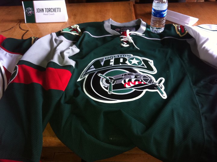
We also have some uniform news! Well, not for the Wild. Minnesota's AHL affiliate, the Houston Aeros, unveiled new jerseys for the upcoming season. The home (white) jersey uses a generic Reebok template.

The road is a green jersey in the form of the Wild's current home jersey template. Perhaps that is how the Wild could do a new green jersey someday in the future.

Finally, the alternate jersey. This is perhaps the most intriguing of the three. It uses the Wild's current alternate template, only in wheat. At least, it looks wheat. It could actually be white, but it looks wheat to me. It follows the same script design for the crest. Once again, this may be something we end up seeing from the Wild in the future. One can only hope!

So that's all I have right now. Hopefully more concepts will come in as we get closer to hockey season. And I have a few ideas for contests for later on, so stay tuned!
We start with a concept! Sam sent in a concept for a green jersey featuring lots of wheat. It goes for a very classic look, using only two colors everywhere but the logo. Notice the primary logo as the crest, yellow/gold nowhere to be seen. Nice job!

We also have some uniform news! Well, not for the Wild. Minnesota's AHL affiliate, the Houston Aeros, unveiled new jerseys for the upcoming season. The home (white) jersey uses a generic Reebok template.

The road is a green jersey in the form of the Wild's current home jersey template. Perhaps that is how the Wild could do a new green jersey someday in the future.
Finally, the alternate jersey. This is perhaps the most intriguing of the three. It uses the Wild's current alternate template, only in wheat. At least, it looks wheat. It could actually be white, but it looks wheat to me. It follows the same script design for the crest. Once again, this may be something we end up seeing from the Wild in the future. One can only hope!

So that's all I have right now. Hopefully more concepts will come in as we get closer to hockey season. And I have a few ideas for contests for later on, so stay tuned!
Sunday, May 29, 2011
Still Here...
Hey all, sorry for the lack of posts for the past two months or so. I have been extremely busy wrapping up high school and such. I haven't had access to my regular computer much either, resulting in very few opportunities to update this blog. But I am here, and I do have some concepts to share!
First off, thanks to Jack at Goal Line Design for sending these in long ago. I am just now posting them, but I think the wait was worth it. First we have an RBK Edge version of Minnesota's old green jersey, I think this turned out excellent. We also see a red alternate jersey. I think it does a great job tying various design elements together. Great work!


Tex also sent in a concept recently. It is a modern jersey for the Minnesota North Stars. Tex put together a new logo for the crest, and went with a mixed color scheme. It's a nice modern spin on an old look.

Thanks for contributing! Keep sending in your concepts!
Tuesday, March 1, 2011
Go Green
Goal Line Design put together a few Wild concepts recently and sent them in. They are both primarily green, but with 2 different themes. The first one goes for more of a retro look, using lots of wheat and striping. Not to mention the circle logo and tie-up collar. The second uses more red, something we don't often see with green jersey concepts. It's kind of refreshing, actually. The 3rd jersey script is used on the front.


These both look awesome. Keep the concepts coming!


These both look awesome. Keep the concepts coming!
Tuesday, February 22, 2011
Outdoors and Camo
I've been busy lately, but that doesn't mean there hasn't been news! Let's start with the Wild's outdoor practice. That's right, the Wild held an outdoor practice. The event went well, and looked pretty cool.


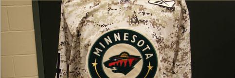
More news: the Wild wore camo warmup jerseys tonight. I read about this last week but didn't get a chance to post it. Anyway, they came out of the locker room in the camo jerseys and wore them in practice. I kinda like them. I find it interesting that they used the home crest with the road number font.


More news: the Wild wore camo warmup jerseys tonight. I read about this last week but didn't get a chance to post it. Anyway, they came out of the locker room in the camo jerseys and wore them in practice. I kinda like them. I find it interesting that they used the home crest with the road number font.


Wednesday, February 16, 2011
What Could Have Been...
On the Wild's website, there is a slide show of some designs for the potential team in Minnesota, had Wild not been chosen as the name. We have long known about the names up for voting, but this is the first we've seen of any designs. The final names were Blue Ox, Freeze, Northern Lights, Voyageurs, White Bears, and, of course, Wild. Obviously Wild was the chosen name, but the others certainly had potential. All of them fit in nicely with the state of Minnesota. Let's take a look at those...missed opportunities.
Blue Ox:


Freeze:


Northern Lights:


Voyageurs:


White Bears:


After seeing these, I am glad they went with Wild. The Northern Lights had some nice tributes to the North Stars, that could have been pretty cool.
Blue Ox:


Freeze:


Northern Lights:


Voyageurs:


White Bears:


After seeing these, I am glad they went with Wild. The Northern Lights had some nice tributes to the North Stars, that could have been pretty cool.
Monday, February 14, 2011
The Champion is Crowned

Congrats gsn93! His concept was voted number 1, winning by one vote. Congrats gsn93, Glen, who came in 2nd, and everyone else who participated. I would like to thank everyone that participated, whether it was sending in a concept of voting. Look forward to more contests in the future!

Saturday, February 5, 2011
Voting: Est. 1967
It's time to vote! Please vote for the design you think is best on the right hand sidebar. The 6 entries are posted below.
Ryan:

Gsn93:

Tex:


Goal Line Design:

Glen:

Chapeeko:


Vote now!
Ryan:

Gsn93:

Tex:


Goal Line Design:

Glen:

Chapeeko:


Vote now!
Thursday, February 3, 2011
A Little More '67


Here is our 6th entry in the Est. 1967 contest. This concept comes from Chapeeko. His design uses green, a darker red, and yellow/gold. The colors fit in quite well with the era. The jersey design uses an old school striping pattern, block numbers, and a very retro logo. Can you spot everything hidden in the logo?
Chances are good that this is the final entry, but the deadline is basically Saturday. I plan to set up the voting system Saturday, assuming I get a chance to do so. The Contest page will be updated when voting is ready, and the poll will be the same layout as last time.
Tuesday, February 1, 2011
February Wallpaper
A new month means a new wallpaper. February's edition includes All Star Brent Burns. As always, this is straight from the official website of the Minnesota Wild.


Saturday, January 29, 2011
Number 5

Our 5th entry in the Est. 1967 contest comes from Glen. His uses red, white, and green, with a circle logo as the crest. The old school M is used inside the logo. The jersey design features contrasting sleeve areas and simple striping. Who knows, this design may set up a 3rd jersey or 2 in the future (wink wink).
Thursday, January 27, 2011
Entry #4

Our 4th entry in the Est. 1967 contest comes from Goal Line Design. His jerseys use red, white, and green and a simple striping design. The logo uses a tree to complete the W, a very retro logo. Great job! I will continue to accept submissions until at least Sunday. Voting will probably begin February 1st, but we will see.
Tuesday, January 25, 2011
Retro State of Hockey


The 3rd entry in the Est. 1967 contest comes from Tex. His design emphasizes green and wheat, with red used as an accent color. Diagonal wordmarks adorn both jerseys, Wild on the green and Minnesota on the wheat. The simple striping pattern features "Wild" on the sleeve stripes and "State of Hockey" on the inside collar. Since Tex's jerseys use wordmarks, he created a separate primary logo. It is a circular logo with the state of Minnesota and a star inside. It is based off of the old Penguins logo from 1968. Nice details! Keep the entries coming everyone!
More 1960's!

Our second entry for the Est. 1967 contest comes from gsn93. This concept uses green, red, and gold (yellow) on the jerseys, and wheat in the logo. The jerseys feature a basic striping pattern and block numbers. The logo is a very 60's MW/nature scene idea. I think it looks pretty cool. I would also like to thank gsn93 for participating here at Wild About Design, we hope to see more from you in the future!
First Entry

The first entry I am posting for the Est. 1967 contest comes from Ryan at Hockey Jersey Concepts. His design uses red, white, and green, and has a very old-school feel to it. The logo is an MW in white. Simple block numerals and a simple striping design. Very 1960's hockey indeed. More entries to come!
Saturday, January 22, 2011
This Day in History

On this day, January 22, in 1998, the NHL's Minnesota franchise selected the name 'Wild'. The Minnesota Wild would begin play in the 2000/2001 NHL season.
Here are a few excerpts from articles written around the time of the unveiling:
Nice touch, the new Minnesota franchise calling a news conference to unveil its new name — Wild — and logo and including Neal Broten in the ceremony. If anyone has done more for hockey in Minnesota than Broten, name him.
But on to the logo, described as iron range red, forest green, harvest gold and Minnesota wheat. Was Minnesota wheat in your box of Crayolas? The Wild, by the way, beat out the Polars, Voyageurs and Blue Ox in fan balloting.
Excerpt from article published in Deseret News
When Minnesota's NHL expansion franchise announced in January 1998 that it would be called the Wild, the obvious question was, "What's a 'Wild?'" The team's response: "Whatever you want it to be."
The Wild's home sweater, unveiled Thursday at the Roseville Skating Center, is dominated by the head of a beast that might be a bear. Or maybe it's a mountain lion? A wolf? A very angry gopher? Who really knows?
And again, that's precisely the point.
"It's a wild picture," chief executive officer Jac Sperling explained. "People will see what they want to see. It's intended to be a wild animal."
Excerpt from article published in Star Tribune
Pretty cool!
Thursday, January 20, 2011
Contest #2!

We are having another contest! Please send in your entries at wildaboutdesign@hotmail.com.
Est. 1967
The year is 1967. The NHL has announced it will expand, adding six new markets to the Original Six teams. Minnesota has been chosen as one of the new markets. Rather than naming the team the North Stars, they go with the Minnesota Wild. Your task is to create an identity for this new team. Required elements include a primary logo and a home and road jersey. Everything else is optional. Remember, it is 1967!
Sunday, January 9, 2011
A Wild Winter Classic Jersey

Today's concept comes from Burke. It is a design for a possible 2012 winter classic. It incorporates the Oregon Wing pattern for their football uniforms, among other aspects. Burke says the back view isn't finished but you can get the idea. There are many elements that would make this jersey unique, I love the star above the back numbers.
Subscribe to:
Comments (Atom)