A blog dedicated to the logos and uniforms of the Minnesota Wild

Thursday, September 30, 2010

NHL 2012: Minnesota Wild

For those of you that don't know, I have been working on an NHL concept project for the past few months. It is NHL 2012. NHL 2012 is a project I put together that takes a look at how teams might look in a few years. I have done a lot of research on NHL uniform trends and marketing over the years, as well as gathered information about possible upcoming changes for this project. In time for the 2012 NHL season, the league expands it's rules to allow teams to have a 4th jersey. This is mostly for marketing purposes. There are several new trends and fads introduced during the next few years, things like wordmarks on the hems of jerseys and other little things like that.

Anyway, I have been posting the teams alphabetically, and I recently got to Minnesota. Naturally, I thought I should post it here. Enjoy!

To find the rest of my NHL 2012 project, copy and paste this link into your browser:

http://bmac25blog.blogspot.com/search/label/NHL%202012

**********

Minnesota Wild

2011: For the Wild's 10th season, the teams comes out in new home and road uniforms. And guess what, they are matching! The red jersey has been modified, and a wheat version is created for the road. The green jersey remains the alternate.

2012: The Wild decide to "go green" and make their alternate jersey their home jersey. A matching white version is also introduced for the road. The alternate wheat jersey ends up being worn several times at home, with the road team wearing their dark jerseys. It is also worn often on the road, almost as much as the designated road jersey.

2011:


2012:


Tuesday, September 28, 2010

The Changes Are Here

On Saturday, January 30th, 2010, I told you all of some possible changes to the Wild's uniforms. Well, preseason hockey has begun, and those changes have indeed taken place. The first thing I said was that the Wild would be wearing different pants. Actually, they would just wear the alternate, stripe-less pants full time. And I was correct.


Here are last year's pants for comparison:


I also spoke of possible changes to the road jersey. And changes have been made. The old shoulder patches have been removed. They have been replaced with an odd rectangular patch with the new wordmark inside.


I think they look awful. I don't mind the wordmark itself, but the rectangular patch is bad. Perhaps they are preparing for an all-new road jersey? One can only hope.

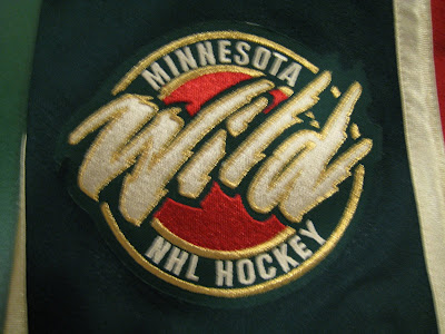
The original Wild wordmark has now been completely phased out. Say good-bye to the first Wild logo ever...


And finally, it appears the 10th Anniversary patch is only being worn on the alternate jerseys. Darn, I wanted to see it on all 3.


So, there you have it. That is basically your uniform season preview.

Tuesday, September 7, 2010

A Whole New Set


Today I share a concept with you from Goal Line Design. This concept gives the Wild a completely new set of uniforms. The home jersey is green, leaving red as the alternate. I think the simple striping design and color usage make this set look great.

Sunday, September 5, 2010

New Wordmarks Released


I mentioned way beck in the early days of this blog that the Wild would be getting rid of their original wordmark logo. And now they have released some new wordmarks. A nod to the past elements, looks good to me.


By the way, here is the original wordmark, no longer in use: