I have been extremely busy lately with the start of class and such, plus there hasn't been much hockey related news, so it's been awhile since I have posted here. Thankfully there has still been some interest in this blog, so I have reason to keep it going.
We start with a concept! Sam sent in a concept for a green jersey featuring lots of wheat. It goes for a very classic look, using only two colors everywhere but the logo. Notice the primary logo as the crest, yellow/gold nowhere to be seen. Nice job!
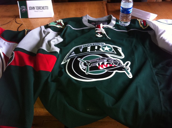
We also have some uniform news! Well, not for the Wild. Minnesota's AHL affiliate, the Houston Aeros, unveiled new jerseys for the upcoming season. The home (white) jersey uses a generic Reebok template.
The road is a green jersey in the form of the Wild's current home jersey template. Perhaps that is how the Wild could do a new green jersey someday in the future.
Finally, the alternate jersey. This is perhaps the most intriguing of the three. It uses the Wild's current alternate template, only in wheat. At least, it looks wheat. It could actually be white, but it looks wheat to me. It follows the same script design for the crest. Once again, this may be something we end up seeing from the Wild in the future. One can only hope!
So that's all I have right now. Hopefully more concepts will come in as we get closer to hockey season. And I have a few ideas for contests for later on, so stay tuned!
A blog dedicated to the logos and uniforms of the Minnesota Wild
Saturday, August 27, 2011
Sunday, May 29, 2011
Still Here...
Hey all, sorry for the lack of posts for the past two months or so. I have been extremely busy wrapping up high school and such. I haven't had access to my regular computer much either, resulting in very few opportunities to update this blog. But I am here, and I do have some concepts to share!
First off, thanks to Jack at Goal Line Design for sending these in long ago. I am just now posting them, but I think the wait was worth it. First we have an RBK Edge version of Minnesota's old green jersey, I think this turned out excellent. We also see a red alternate jersey. I think it does a great job tying various design elements together. Great work!


Tex also sent in a concept recently. It is a modern jersey for the Minnesota North Stars. Tex put together a new logo for the crest, and went with a mixed color scheme. It's a nice modern spin on an old look.

Thanks for contributing! Keep sending in your concepts!
First off, thanks to Jack at Goal Line Design for sending these in long ago. I am just now posting them, but I think the wait was worth it. First we have an RBK Edge version of Minnesota's old green jersey, I think this turned out excellent. We also see a red alternate jersey. I think it does a great job tying various design elements together. Great work!


Tex also sent in a concept recently. It is a modern jersey for the Minnesota North Stars. Tex put together a new logo for the crest, and went with a mixed color scheme. It's a nice modern spin on an old look.

Thanks for contributing! Keep sending in your concepts!
Tuesday, March 1, 2011
Go Green
Goal Line Design put together a few Wild concepts recently and sent them in. They are both primarily green, but with 2 different themes. The first one goes for more of a retro look, using lots of wheat and striping. Not to mention the circle logo and tie-up collar. The second uses more red, something we don't often see with green jersey concepts. It's kind of refreshing, actually. The 3rd jersey script is used on the front.


These both look awesome. Keep the concepts coming!


These both look awesome. Keep the concepts coming!
Tuesday, February 22, 2011
Outdoors and Camo
I've been busy lately, but that doesn't mean there hasn't been news! Let's start with the Wild's outdoor practice. That's right, the Wild held an outdoor practice. The event went well, and looked pretty cool.


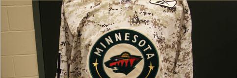
More news: the Wild wore camo warmup jerseys tonight. I read about this last week but didn't get a chance to post it. Anyway, they came out of the locker room in the camo jerseys and wore them in practice. I kinda like them. I find it interesting that they used the home crest with the road number font.


More news: the Wild wore camo warmup jerseys tonight. I read about this last week but didn't get a chance to post it. Anyway, they came out of the locker room in the camo jerseys and wore them in practice. I kinda like them. I find it interesting that they used the home crest with the road number font.


Wednesday, February 16, 2011
What Could Have Been...
On the Wild's website, there is a slide show of some designs for the potential team in Minnesota, had Wild not been chosen as the name. We have long known about the names up for voting, but this is the first we've seen of any designs. The final names were Blue Ox, Freeze, Northern Lights, Voyageurs, White Bears, and, of course, Wild. Obviously Wild was the chosen name, but the others certainly had potential. All of them fit in nicely with the state of Minnesota. Let's take a look at those...missed opportunities.
Blue Ox:


Freeze:


Northern Lights:


Voyageurs:


White Bears:


After seeing these, I am glad they went with Wild. The Northern Lights had some nice tributes to the North Stars, that could have been pretty cool.
Blue Ox:


Freeze:


Northern Lights:


Voyageurs:


White Bears:


After seeing these, I am glad they went with Wild. The Northern Lights had some nice tributes to the North Stars, that could have been pretty cool.
Monday, February 14, 2011
The Champion is Crowned
Saturday, February 5, 2011
Voting: Est. 1967
Subscribe to:
Posts (Atom)