A blog dedicated to the logos and uniforms of the Minnesota Wild

Showing posts with label Concepts. Show all posts

Sunday, January 20, 2013

A Snowy Night Alternate

Shane P sent in an awesome concept that give the Wild a very different look. Shane eliminated red and wheat from the color scheme and added silver and black.

"I've completely phased out the red. I know that's a polarizing approach, but I think the Wild are better off not sharing their colors with a major holiday. That's why I chose Green and White, with Silver, then Black as accent colors. No one has claimed Green outright in the NHL and I think it would be perfect for the Wild."


An interesting choice, but I think it turned out pretty cool. The home and road jerseys have a retro feel to them, but not full-on vintage.

"I incorporated the pattern from the 1980's Flyer's jerseys in some way for each design, most heavily in the home jersey. It's probably my favorite pattern, and if they don't want it, I think we use a form of it. I also added the shooting star from their logo to the breezers. This has been done before by someone, but they had the star pointing the other way, which I think looks weird, so i just flipped it."


My personal favorite part of this concept is the alternate uniform. Shane used a different set of colors to create what he calls a snowy night theme.

"My alternate is pretty different, but I think it's a cool look. I altered the logo to look like a snowfall and added a snowflake pattern for the shoulder patch. A very dark Blue and White I think works perfect with the theme. Kind of a "snowy night" theme."


Thanks to Shane for sending in these awesome designs! I love the snowy night alternate.

Tuesday, October 25, 2011

Harvesting Gold

Sam sent in a concept a while back, I am finally getting around to posting it. Sam pointed out most concepts eliminate harvest gold (usually highlighting wheat instead), so he put together a home/road set that uses it. He also adds an alternate jersey that is completely devoid of harvest gold.

Saturday, August 27, 2011

School is Here, Hockey Will Be Soon!

I have been extremely busy lately with the start of class and such, plus there hasn't been much hockey related news, so it's been awhile since I have posted here. Thankfully there has still been some interest in this blog, so I have reason to keep it going.

We start with a concept! Sam sent in a concept for a green jersey featuring lots of wheat. It goes for a very classic look, using only two colors everywhere but the logo. Notice the primary logo as the crest, yellow/gold nowhere to be seen. Nice job!


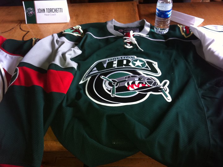
We also have some uniform news! Well, not for the Wild. Minnesota's AHL affiliate, the Houston Aeros, unveiled new jerseys for the upcoming season. The home (white) jersey uses a generic Reebok template.


The road is a green jersey in the form of the Wild's current home jersey template. Perhaps that is how the Wild could do a new green jersey someday in the future.


Finally, the alternate jersey. This is perhaps the most intriguing of the three. It uses the Wild's current alternate template, only in wheat. At least, it looks wheat. It could actually be white, but it looks wheat to me. It follows the same script design for the crest. Once again, this may be something we end up seeing from the Wild in the future. One can only hope!


So that's all I have right now. Hopefully more concepts will come in as we get closer to hockey season. And I have a few ideas for contests for later on, so stay tuned!

Sunday, May 29, 2011

Still Here...

Hey all, sorry for the lack of posts for the past two months or so. I have been extremely busy wrapping up high school and such. I haven't had access to my regular computer much either, resulting in very few opportunities to update this blog. But I am here, and I do have some concepts to share!

First off, thanks to Jack at Goal Line Design for sending these in long ago. I am just now posting them, but I think the wait was worth it. First we have an RBK Edge version of Minnesota's old green jersey, I think this turned out excellent. We also see a red alternate jersey. I think it does a great job tying various design elements together. Great work!


Tex also sent in a concept recently. It is a modern jersey for the Minnesota North Stars. Tex put together a new logo for the crest, and went with a mixed color scheme. It's a nice modern spin on an old look.


Thanks for contributing! Keep sending in your concepts!

Tuesday, March 1, 2011

Go Green

Goal Line Design put together a few Wild concepts recently and sent them in. They are both primarily green, but with 2 different themes. The first one goes for more of a retro look, using lots of wheat and striping. Not to mention the circle logo and tie-up collar. The second uses more red, something we don't often see with green jersey concepts. It's kind of refreshing, actually. The 3rd jersey script is used on the front.


These both look awesome. Keep the concepts coming!

Thursday, February 3, 2011

A Little More '67


Here is our 6th entry in the Est. 1967 contest. This concept comes from Chapeeko. His design uses green, a darker red, and yellow/gold. The colors fit in quite well with the era. The jersey design uses an old school striping pattern, block numbers, and a very retro logo. Can you spot everything hidden in the logo?

Chances are good that this is the final entry, but the deadline is basically Saturday. I plan to set up the voting system Saturday, assuming I get a chance to do so. The Contest page will be updated when voting is ready, and the poll will be the same layout as last time.

Saturday, January 29, 2011

Number 5


Our 5th entry in the Est. 1967 contest comes from Glen. His uses red, white, and green, with a circle logo as the crest. The old school M is used inside the logo. The jersey design features contrasting sleeve areas and simple striping. Who knows, this design may set up a 3rd jersey or 2 in the future (wink wink).

Thursday, January 27, 2011

Entry #4


Our 4th entry in the Est. 1967 contest comes from Goal Line Design. His jerseys use red, white, and green and a simple striping design. The logo uses a tree to complete the W, a very retro logo. Great job! I will continue to accept submissions until at least Sunday. Voting will probably begin February 1st, but we will see.

Tuesday, January 25, 2011

Retro State of Hockey


The 3rd entry in the Est. 1967 contest comes from Tex. His design emphasizes green and wheat, with red used as an accent color. Diagonal wordmarks adorn both jerseys, Wild on the green and Minnesota on the wheat. The simple striping pattern features "Wild" on the sleeve stripes and "State of Hockey" on the inside collar. Since Tex's jerseys use wordmarks, he created a separate primary logo. It is a circular logo with the state of Minnesota and a star inside. It is based off of the old Penguins logo from 1968. Nice details! Keep the entries coming everyone!

More 1960's!


Our second entry for the Est. 1967 contest comes from gsn93. This concept uses green, red, and gold (yellow) on the jerseys, and wheat in the logo. The jerseys feature a basic striping pattern and block numbers. The logo is a very 60's MW/nature scene idea. I think it looks pretty cool. I would also like to thank gsn93 for participating here at Wild About Design, we hope to see more from you in the future!

First Entry


The first entry I am posting for the Est. 1967 contest comes from Ryan at Hockey Jersey Concepts. His design uses red, white, and green, and has a very old-school feel to it. The logo is an MW in white. Simple block numerals and a simple striping design. Very 1960's hockey indeed. More entries to come!

Sunday, January 9, 2011

A Wild Winter Classic Jersey


Today's concept comes from Burke. It is a design for a possible 2012 winter classic. It incorporates the Oregon Wing pattern for their football uniforms, among other aspects. Burke says the back view isn't finished but you can get the idea. There are many elements that would make this jersey unique, I love the star above the back numbers.

Friday, December 31, 2010

Final Entry...


...as far as I know anyway. I don't anticipate any more being sent in. Anyway, the final entry comes from...me! I don't have much to say, I hope you like it.


Voting will be set up shortly. Please vote for the design you think is the best.

Tuesday, December 28, 2010

Another Entry


Tex sent in his entry for the North Stars contest. It has a nice balance of colors, I love the green jersey.


I will keep this open until the end of the year, and then on the 1st of January I will set up the voting system.

Thursday, December 23, 2010

More North Stars!


The second contest entry comes from Ryan at Hockey Jersey Concepts. He did a great job modernizing the North Stars classic look. He even included a black alternate jersey. Great job!

PS- Once all of the entries are posted, be sure to vote for you favorite!

Wednesday, December 22, 2010

1st Contest Entry


The first entry for the North Stars contest comes from Goal Line Design. He used a nice, simple design and the 3D N logo. Green and yellow looking good!

Northern Inspiration


Goal Line Design put together a concept for the Wild based strongly on the old Minnesota North Stars uniforms. The old striping design has been updated in Wild colors, and the circle logo is the crest. I think this is a nice tribute to the North Stars, great job!

Saturday, December 18, 2010

CONTEST!

We are having a contest! Please send in your entries at wildaboutdesign@hotmail.com.

Minnesota North Stars Contest

The task is simple: design the uniforms of the Minnesota North Stars if they were to enter the NHL today. All entries must include a home and road jersey. Alternate jerseys and extra equipment (helmets, pants, gloves, socks) are optional. You can do whatever you want, have fun!

Green and Wheat


Goal Line Design sent in a new concept for a home and road jersey for the Wild. The jerseys are green and wheat, both following an old-school theme, similar to Minnesota's current home uniforms. Excellent work! Also, be sure to check out what's going on at Goal Line Design.

Stripes: Part 2


Last Monday I posted a concept from Tex, a green jersey with red and wheat stripes. Well, he also made a wheat version! Once again, great work. I love how the green and red stripes look together.