

Wednesday, January 30, 2013
Alternates to be Worn Tonight
Nothing too newsworthy, but I figured it was worth noting. The Wild will wear their green alternate jerseys tonight when they host the Chicago Blackhawks. The Wild look to win back-to-back games tonight, let's hope they do it!


Tuesday, January 22, 2013
Happy 15th Birthday to the Nickname "Wild"

On January 22, 1998, Minnesota's NHL expansion franchise announced their nickname and released their first logo! The name "Wild" was announced, beating out Blue Ox, Freeze, Northern Lights, Voyageurs and White Bears. The colors of Forest Green, Iron Range Red, and Harvest Gold, which are still used today. An unveiling took place at Aldrich Arena in Maplewood to show off the name and logo of Minnesota's new franchise.

Interestingly enough, the current primary logo was nowhere to be seen. The primary logo that was initially released was a script logo, featuring "Wild" in green with gold and red outlines. The logo that eventually showed up on the jerseys as a sleeve patch featured the script logo over a roundel that featured the words "Minnesota" and "NHL Hockey."

These logos were used for Minnesota until the 2000/20001 NHL season when the Wild finally took the ice. At this point the current primary logo, the bear head depicting a wilderness scene, was introduced. It donned the front of the inaugural jerseys.

The Wild are yet to make any changes to their primary logo. While several alternate logos and scripts have been developed, the bear head logo remains the primary symbol of the Minnesota Wild.
Just for fun, here are some cool shots of the old shoulder patch I took from my green jersey:


Monday, January 21, 2013
Monday News & Notes
Unfortunately I don't have a full blog post for you all today. I do, however, have a few things to share.

Graphics Collection From ColorWerx
It's exactly what it sounds like. ColorWerx posted a collection of Minnesota Wild graphics on his blog. It's his collection of color-optimized graphics (he puts a lot of time into this and does an incredible job), which is pretty cool if you're into that kind of thing. It's his work, so I'll just post the link to his blog post:
ColorWerx: Minnesota Wild Graphics
More Concepts on the Way
News relating to the logos and uniforms of the Minnesota Wild only comes so often. Now that the season is underway, news will most likely be harder to come by for awhile. This means I will be posting more concepts that are sent in. I have a handful that have already been sent in that are ready to post, I'm hoping to get a few more. Remember to email your concepts to wildaboutdesign@hotmail.com!
I will also add that with the assumed lack of news coming our way I plan to explore some other options for the blog. If I am able to gain enough interest, another Concept Contest will be put together. There are also plans for some jersey critiques and other fun things.
Remember, keep your stick on the ice!

Graphics Collection From ColorWerx
It's exactly what it sounds like. ColorWerx posted a collection of Minnesota Wild graphics on his blog. It's his collection of color-optimized graphics (he puts a lot of time into this and does an incredible job), which is pretty cool if you're into that kind of thing. It's his work, so I'll just post the link to his blog post:
ColorWerx: Minnesota Wild Graphics
More Concepts on the Way
News relating to the logos and uniforms of the Minnesota Wild only comes so often. Now that the season is underway, news will most likely be harder to come by for awhile. This means I will be posting more concepts that are sent in. I have a handful that have already been sent in that are ready to post, I'm hoping to get a few more. Remember to email your concepts to wildaboutdesign@hotmail.com!
I will also add that with the assumed lack of news coming our way I plan to explore some other options for the blog. If I am able to gain enough interest, another Concept Contest will be put together. There are also plans for some jersey critiques and other fun things.
Remember, keep your stick on the ice!
Sunday, January 20, 2013
A Snowy Night Alternate
Shane P sent in an awesome concept that give the Wild a very different look. Shane eliminated red and wheat from the color scheme and added silver and black.
"I've completely phased out the red. I know that's a polarizing approach, but I think the Wild are better off not sharing their colors with a major holiday. That's why I chose Green and White, with Silver, then Black as accent colors. No one has claimed Green outright in the NHL and I think it would be perfect for the Wild."


An interesting choice, but I think it turned out pretty cool. The home and road jerseys have a retro feel to them, but not full-on vintage.
"I incorporated the pattern from the 1980's Flyer's jerseys in some way for each design, most heavily in the home jersey. It's probably my favorite pattern, and if they don't want it, I think we use a form of it. I also added the shooting star from their logo to the breezers. This has been done before by someone, but they had the star pointing the other way, which I think looks weird, so i just flipped it."


My personal favorite part of this concept is the alternate uniform. Shane used a different set of colors to create what he calls a snowy night theme.
"My alternate is pretty different, but I think it's a cool look. I altered the logo to look like a snowfall and added a snowflake pattern for the shoulder patch. A very dark Blue and White I think works perfect with the theme. Kind of a "snowy night" theme."

Thanks to Shane for sending in these awesome designs! I love the snowy night alternate.
"I incorporated the pattern from the 1980's Flyer's jerseys in some way for each design, most heavily in the home jersey. It's probably my favorite pattern, and if they don't want it, I think we use a form of it. I also added the shooting star from their logo to the breezers. This has been done before by someone, but they had the star pointing the other way, which I think looks weird, so i just flipped it."


My personal favorite part of this concept is the alternate uniform. Shane used a different set of colors to create what he calls a snowy night theme.
"My alternate is pretty different, but I think it's a cool look. I altered the logo to look like a snowfall and added a snowflake pattern for the shoulder patch. A very dark Blue and White I think works perfect with the theme. Kind of a "snowy night" theme."

Thanks to Shane for sending in these awesome designs! I love the snowy night alternate.
Alternate Jerseys to be Worn 9 Times
The Minnesota Wild will wear their green alternate jerseys for nines games this season, according to the equipment manager. Tonight's home game against Dallas will be the first of the nine games. I am currently in the process of finding out the other eight games the alternates will be worn and will post as soon as I know.


Saturday, January 19, 2013
Hockey Day Minnesota & Season Opener

What a wonderful day for hockey! It's Hockey Day Minnesota 2013, and the NHL resumes play today. The Wild host the Colorado Avalanche at the Xcel Energy Center in St. Paul tonight. It should be a fun day for hockey fans in Minnesota. We would love it if anyone attending today's events sent in pictures!
Check out this awesome infographic from the Wild's website (click for larger):

Enjoy the return of the NHL! And please send in pictures if you attend any of today's events!
Friday, January 18, 2013
New Decals on Player Helmets
New season, new helmet decals. This year's helmets feature the new(ish) wordmark on the back. The white helmet still has the primary logo and stylized numerals from the white jersey. The home helmet is green with the 3rd jersey wordmark and wheat block numerals.


The NHL is Back, and So Are We(?)
Hopefully you know by now that the NHL is back from its lockout. Play will resume, and hopefully so will this blog. We are, however, looking to make big changes.
New Name?
That's right, we're considering a new name for the blog. Wild About Design is fine, but perhaps there is something better. New name suggestions are welcome. A voting poll will be set up on the sidebar asking your opinion on a name change. Please vote. A re-brand is coming too, but that is dependent on the name.
Assistance Needed
We are looking to expand here at Wild About Design. The hope is that we can eventually set up a little community of people interested in this topic. My ultimate goal is to get a blog/following started for multiple teams.
At this point, I am specifically looking for a number of people to help. For starters, anyone wishing to write blog posts, please let me know. This can be news, concepts, critiques, whatever. I would love to get some more contributing partners. We are also looking for solidified featured artists. In other words, a group of designers that would be willing to submit concepts on a somewhat regular basis. In the past we have had concepts sent in from all kinds of designers, but a firm group would be awesome.
If anyone is interested in helping in ANY way, please let me know.
Email Us!
There were some problems between various blogger and email accounts, but everything has been sorted out now. So email wildaboutdesign@hotmail.com with news, concepts, photos, whatever! It will get posted along with any description you wish to include, and all proper credit will be given to the contributor.
*****
So, is there any interest in keeping this blog going? It is a personal hobby of mine, but I would love to shape it into an interesting information center for hockey and sports branding fans. Please let us know if there is any interest.
Leave comments here, email wildaboutdesign@hotmail.com, or hit us up on Twitter, @WildAboutDesign.
New Name?
That's right, we're considering a new name for the blog. Wild About Design is fine, but perhaps there is something better. New name suggestions are welcome. A voting poll will be set up on the sidebar asking your opinion on a name change. Please vote. A re-brand is coming too, but that is dependent on the name.
Assistance Needed
We are looking to expand here at Wild About Design. The hope is that we can eventually set up a little community of people interested in this topic. My ultimate goal is to get a blog/following started for multiple teams.
At this point, I am specifically looking for a number of people to help. For starters, anyone wishing to write blog posts, please let me know. This can be news, concepts, critiques, whatever. I would love to get some more contributing partners. We are also looking for solidified featured artists. In other words, a group of designers that would be willing to submit concepts on a somewhat regular basis. In the past we have had concepts sent in from all kinds of designers, but a firm group would be awesome.
If anyone is interested in helping in ANY way, please let me know.
Email Us!
There were some problems between various blogger and email accounts, but everything has been sorted out now. So email wildaboutdesign@hotmail.com with news, concepts, photos, whatever! It will get posted along with any description you wish to include, and all proper credit will be given to the contributor.
*****
So, is there any interest in keeping this blog going? It is a personal hobby of mine, but I would love to shape it into an interesting information center for hockey and sports branding fans. Please let us know if there is any interest.
Leave comments here, email wildaboutdesign@hotmail.com, or hit us up on Twitter, @WildAboutDesign.
Saturday, December 10, 2011
Still Alive
Just a heads up, I am still trying to keep this blog going. A combination of lack of time and account issues have lead to very few posts over the last few months. But I do have some concepts to post! Stick around...
Tuesday, October 25, 2011
Harvesting Gold
Sam sent in a concept a while back, I am finally getting around to posting it. Sam pointed out most concepts eliminate harvest gold (usually highlighting wheat instead), so he put together a home/road set that uses it. He also adds an alternate jersey that is completely devoid of harvest gold.


Monday, October 10, 2011
2011-2012 3rd Jersey Schedule Posted
The Wild broke out their 3rd jerseys on Saturday against Columbus. The schedule for the rest of the season has now been posted under the '3rd Jersey Schedule' tab.


Hockey is Here!
That's right, the puck had dropped. The 2011-2012 NHL regular season is underway! Unfortunately, I am as busy as ever and haven't caught a single game yet. Nor have I had much time for posting here. But do not worry, Wild About Design is still alive. I have a some small news items and a few concepts to post, so stay tuned!
Saturday, August 27, 2011
School is Here, Hockey Will Be Soon!
I have been extremely busy lately with the start of class and such, plus there hasn't been much hockey related news, so it's been awhile since I have posted here. Thankfully there has still been some interest in this blog, so I have reason to keep it going.
We start with a concept! Sam sent in a concept for a green jersey featuring lots of wheat. It goes for a very classic look, using only two colors everywhere but the logo. Notice the primary logo as the crest, yellow/gold nowhere to be seen. Nice job!

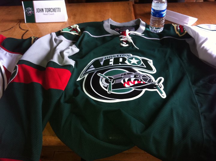
We also have some uniform news! Well, not for the Wild. Minnesota's AHL affiliate, the Houston Aeros, unveiled new jerseys for the upcoming season. The home (white) jersey uses a generic Reebok template.

The road is a green jersey in the form of the Wild's current home jersey template. Perhaps that is how the Wild could do a new green jersey someday in the future.

Finally, the alternate jersey. This is perhaps the most intriguing of the three. It uses the Wild's current alternate template, only in wheat. At least, it looks wheat. It could actually be white, but it looks wheat to me. It follows the same script design for the crest. Once again, this may be something we end up seeing from the Wild in the future. One can only hope!

So that's all I have right now. Hopefully more concepts will come in as we get closer to hockey season. And I have a few ideas for contests for later on, so stay tuned!
We start with a concept! Sam sent in a concept for a green jersey featuring lots of wheat. It goes for a very classic look, using only two colors everywhere but the logo. Notice the primary logo as the crest, yellow/gold nowhere to be seen. Nice job!

We also have some uniform news! Well, not for the Wild. Minnesota's AHL affiliate, the Houston Aeros, unveiled new jerseys for the upcoming season. The home (white) jersey uses a generic Reebok template.

The road is a green jersey in the form of the Wild's current home jersey template. Perhaps that is how the Wild could do a new green jersey someday in the future.
Finally, the alternate jersey. This is perhaps the most intriguing of the three. It uses the Wild's current alternate template, only in wheat. At least, it looks wheat. It could actually be white, but it looks wheat to me. It follows the same script design for the crest. Once again, this may be something we end up seeing from the Wild in the future. One can only hope!

So that's all I have right now. Hopefully more concepts will come in as we get closer to hockey season. And I have a few ideas for contests for later on, so stay tuned!
Sunday, May 29, 2011
Still Here...
Hey all, sorry for the lack of posts for the past two months or so. I have been extremely busy wrapping up high school and such. I haven't had access to my regular computer much either, resulting in very few opportunities to update this blog. But I am here, and I do have some concepts to share!
First off, thanks to Jack at Goal Line Design for sending these in long ago. I am just now posting them, but I think the wait was worth it. First we have an RBK Edge version of Minnesota's old green jersey, I think this turned out excellent. We also see a red alternate jersey. I think it does a great job tying various design elements together. Great work!


Tex also sent in a concept recently. It is a modern jersey for the Minnesota North Stars. Tex put together a new logo for the crest, and went with a mixed color scheme. It's a nice modern spin on an old look.

Thanks for contributing! Keep sending in your concepts!
First off, thanks to Jack at Goal Line Design for sending these in long ago. I am just now posting them, but I think the wait was worth it. First we have an RBK Edge version of Minnesota's old green jersey, I think this turned out excellent. We also see a red alternate jersey. I think it does a great job tying various design elements together. Great work!


Tex also sent in a concept recently. It is a modern jersey for the Minnesota North Stars. Tex put together a new logo for the crest, and went with a mixed color scheme. It's a nice modern spin on an old look.

Thanks for contributing! Keep sending in your concepts!
Tuesday, March 1, 2011
Go Green
Goal Line Design put together a few Wild concepts recently and sent them in. They are both primarily green, but with 2 different themes. The first one goes for more of a retro look, using lots of wheat and striping. Not to mention the circle logo and tie-up collar. The second uses more red, something we don't often see with green jersey concepts. It's kind of refreshing, actually. The 3rd jersey script is used on the front.


These both look awesome. Keep the concepts coming!


These both look awesome. Keep the concepts coming!
Tuesday, February 22, 2011
Outdoors and Camo
I've been busy lately, but that doesn't mean there hasn't been news! Let's start with the Wild's outdoor practice. That's right, the Wild held an outdoor practice. The event went well, and looked pretty cool.


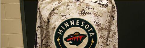
More news: the Wild wore camo warmup jerseys tonight. I read about this last week but didn't get a chance to post it. Anyway, they came out of the locker room in the camo jerseys and wore them in practice. I kinda like them. I find it interesting that they used the home crest with the road number font.


More news: the Wild wore camo warmup jerseys tonight. I read about this last week but didn't get a chance to post it. Anyway, they came out of the locker room in the camo jerseys and wore them in practice. I kinda like them. I find it interesting that they used the home crest with the road number font.


Wednesday, February 16, 2011
What Could Have Been...
On the Wild's website, there is a slide show of some designs for the potential team in Minnesota, had Wild not been chosen as the name. We have long known about the names up for voting, but this is the first we've seen of any designs. The final names were Blue Ox, Freeze, Northern Lights, Voyageurs, White Bears, and, of course, Wild. Obviously Wild was the chosen name, but the others certainly had potential. All of them fit in nicely with the state of Minnesota. Let's take a look at those...missed opportunities.
Blue Ox:


Freeze:


Northern Lights:


Voyageurs:


White Bears:


After seeing these, I am glad they went with Wild. The Northern Lights had some nice tributes to the North Stars, that could have been pretty cool.
Blue Ox:


Freeze:


Northern Lights:


Voyageurs:


White Bears:


After seeing these, I am glad they went with Wild. The Northern Lights had some nice tributes to the North Stars, that could have been pretty cool.
Monday, February 14, 2011
The Champion is Crowned

Congrats gsn93! His concept was voted number 1, winning by one vote. Congrats gsn93, Glen, who came in 2nd, and everyone else who participated. I would like to thank everyone that participated, whether it was sending in a concept of voting. Look forward to more contests in the future!

Saturday, February 5, 2011
Voting: Est. 1967
It's time to vote! Please vote for the design you think is best on the right hand sidebar. The 6 entries are posted below.
Ryan:

Gsn93:

Tex:


Goal Line Design:

Glen:

Chapeeko:


Vote now!
Ryan:

Gsn93:

Tex:


Goal Line Design:

Glen:

Chapeeko:


Vote now!
Subscribe to:
Posts (Atom)